Commercial disclosure: HomeChoiceWorks may earn a commission if you purchase through certain links on this page. Editorial recommendations are based on the decision factors described here.
Good fonts for logos are not simply the ones that look most striking at poster size. A usable wordmark needs recognizable letters, reliable spacing, the characters your brand actually uses, and a consistent look when reduced to a tiny label or profile image. The price of an entire font family matters only when the additional styles solve a real brand-system problem.
Write down the real brand name, the smallest place the logo will appear, the languages it needs, and who will edit the files. Compare a compact set of typefaces using exactly that brief. Buy a paid family when its distinctive letters, useful variants or ongoing brand applications justify the license; use an appropriately licensed free font if it already solves the brief.
Use the same brand brief for every candidate
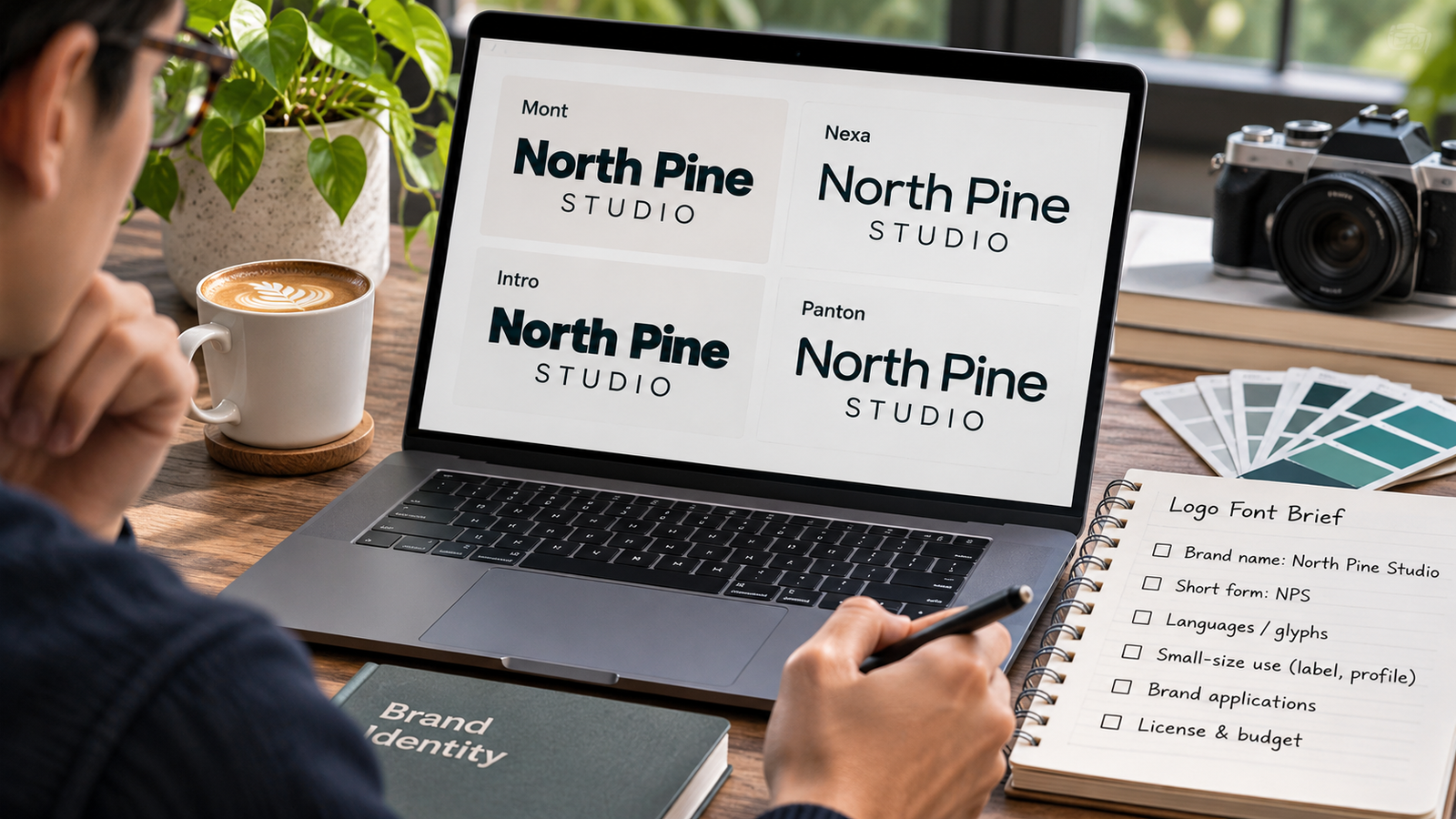
Imagine a small maker launching “North Pine Studio.” Instead of judging fonts by the seller’s default pangram, prepare one comparison sheet for every candidate:
- Real name: North Pine Studio, in the proposed capitalization and with the exact ampersands or punctuation the brand uses.
- Short form: NPS or the expected two-letter monogram. Check whether similar shapes blur together.
- Supporting line: STUDIO / HANDMADE GOODS / 2026. A display font may fail on small supporting text.
- Character coverage: test accented letters and non-English scripts the business genuinely needs. Do not assume a font covers every language because its Latin sample looks complete.
- Sizes: review small packaging, a phone-profile crop and a large storefront mockup, with comparable spacing and contrast.
This is a repeatable evaluation procedure, not a claim that HomeChoiceWorks has rendered or independently tested the fonts below. Fontfabric offers a text tester on family pages, while an actual choice should also be inspected in your own authorized design software with the same wording and layout.
How four Fontfabric families differ on paper
The distinctions below come from Fontfabric’s own family descriptions and specifications, not from an independently scored legibility test. Check the current family/style you intend to license, because a marketing family name can encompass multiple subfamilies or editions.
| Candidate | Why to shortlist it | When to pass or verify more |
|---|---|---|
| Mont | A geometric sans family with 22 styles and variable versions, plus documented Extended Latin, Cyrillic and Greek support. Useful to evaluate when the wordmark must sit inside a larger consistent identity. | Its geometric voice may be too neutral for a very distinctive standalone mark; verify the exact variable/static files and intended character set. |
| Nexa | A contemporary geometric family with a main range and a separate Nexa Text range in the listed 36-style family. Worth considering where wordmark and longer supporting copy should share a related visual system. | Do not pay for the Text subfamily solely for a one-line logo; check whether the selected style alone is enough. |
| Intro | Fontfabric describes a geometric structure with humanist details and stylistic alternatives. A candidate when the brand is deliberately bold or expressive. | Verify the exact logo letters at small sizes and ensure special forms do not reduce recognition in short names. |
| Panton | The foundry describes softened geometric shapes and a wide selection of weights and widths. Useful to compare for a warm, adaptable identity. | Softer curves are an aesthetic choice, not proof of higher readability; compare the actual chosen weight and spacing. |
| Open-source Google Fonts family | A legitimate no-license-fee starting point for many small commercial projects; inspect the chosen family’s source license. | Expect shared availability rather than an exclusive visual signature; check glyph coverage and the exact licensing terms before altering or redistributing font files. |
Fontfabric curates several of these options in its logo-font collection, but the fact that a foundry lists a family for logos does not establish it is the best match for your business.
Four filters that matter more than a “top ten” ranking
1. Can someone read the real wordmark quickly?
Check likely confusion between I/l/1, O/0, rn/m, and narrow letter pairs in the actual brand name. A beautiful display specimen is less relevant than whether a person can recognize the name at the size used on packaging or a mobile screen. Examine spacing in the real file, not a screenshot enlarged in isolation.
2. Does it have the characters you will truly need?
Mont’s official specifications list Extended Latin, Cyrillic and Greek. Nexa’s family details describe Extended Latin and Cyrillic. These are vendor descriptions, not a guarantee for every language or special character in your logo. Check required accents, ligatures, currency symbols and the exact font style with the seller’s glyph map or a permitted preview.
3. Will the identity extend beyond one wordmark?
A one-color logo may need just one well-chosen style. A multi-channel brand may need Regular, Semibold, italic, condensed or other coordinated styles for labels, headings, menus and signage. Put those needs on the brief first; otherwise a larger family can become a purchase without a job to do.
4. Can the chosen files legally move through your workflow?
Fontfabric says its Desktop license applies to logo and static branding design, while live website text uses a different license. Its commercial free-font agreement permits certain free-font logo uses, but trial fonts are for internal evaluation rather than a shipped commercial logo. A freelancer and the final brand owner should identify who needs installed font files and preserve the order/EULA.
Buying legal permission to use a typeface does not establish that your completed logo is available as a trademark. The U.S. Patent and Trademark Office explains why businesses should search for confusingly similar marks before filing. Treat the visual identity decision and trademark search as two separate tasks; seek professional advice for consequential disputes.
When paid fonts earn their cost—and when they do not
A paid family may be worthwhile when a particular licensed design precisely fits the name, needed glyphs, intended applications and consistent brand system. But the commercial case should be specific: the extra styles will be used, the rights are understood, and the chosen letterforms improve the actual brief.
Consider a free alternative first if the brand has one short wordmark, an open-source family passes the same sample tests, or a modest design budget is better spent on the identity itself. The SIL OFL permits logo use for fonts released under that license, with its conditions; Google Fonts likewise documents commercial use for its open-source catalog. Neither route makes a common font exclusive to your brand.
Round one: compare three visually different families using the identical brand name and small-size mockup. Round two: for the remaining one or two, verify the exact style, license owner, expected client handoff and any future print or web use. Only then compare a single-style purchase with a full-family option.
When the brand brief points to a Fontfabric style, use the official family tester and check the license before placing an order.
Explore Fontfabric logo typefaces
The decision to take away
Choose a logo font for how the actual brand name performs at the sizes and in the languages that matter, not for the prettiest sample image. If an appropriately licensed free family passes, it may be the better purchase decision. If you buy a premium family, buy the particular styles and permissions your identity will use—not the largest bundle by default.
Sources and method: Fontfabric’s family pages and licensing documents, the SIL OFL, Google Fonts documentation and USPTO trademark guidance. Checked November 7, 2026. Family descriptions are attributed to their publisher; no firsthand font rendering, logo trial or trademark clearance is claimed.
Keep researching
More decision guides from the same topic area.
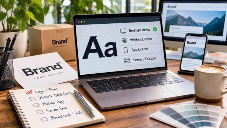
Font Licensing for Commercial Use: Choose the Right Rights Before You Pay
Font licensing explained for commercial use should start with the finished deliverable, not the font’s price tag. A logo…
Read guide →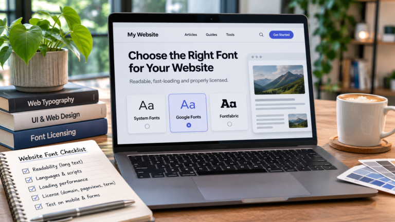
Best Fonts for a Website: Choose for Reading, Loading and License Cost
The best fonts for a website are the ones that keep its text readable, support the languages it publishes,…
Read guide →