
Commercial disclosure: HomeChoiceWorks may earn a commission if you purchase through certain links on this page. Editorial recommendations are based on the decision factors described here.
The best fonts for a website are the ones that keep its text readable, support the languages it publishes, load dependably and come with permission for the way the site serves them. A premium typeface can help express a brand, but it can also add license scope and technical work that a small publisher does not need.
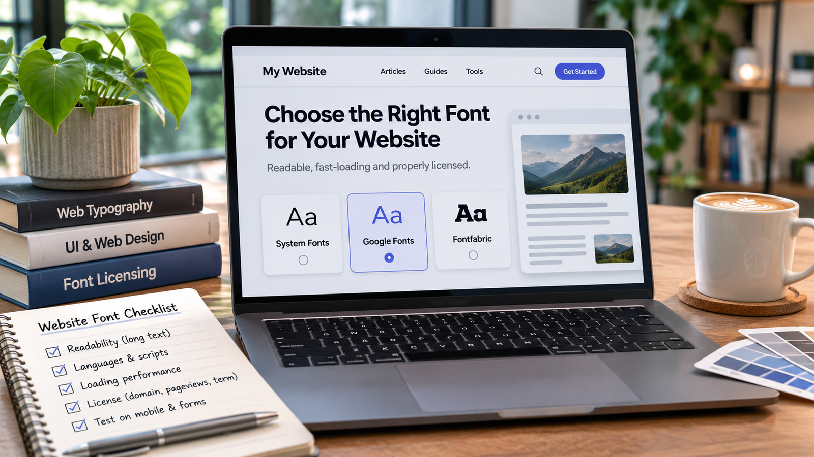
For a small, text-heavy site, start by evaluating a readable system stack or appropriately licensed open-source webfont for body copy. Add one paid display or text family only if it makes a specific brand or content improvement you can see in real page samples. If choosing Fontfabric’s retail webfonts, verify the licensed domain, monthly pageviews, file formats and annual/perpetual term before checkout.
Define the site before judging font specimens
Consider an English-first independent service website with articles, a mobile navigation bar, call-to-action buttons and a few product tables. Its typography has four jobs: extended reading, clear navigation, distinct headings and trustworthy form labels. A candidate that looks excellent in a huge hero line may still be wrong for paragraphs or mobile buttons.
Write down the site’s real languages and scripts, existing platform/theme, intended pageview range, the number of live font weights needed and who can maintain the font files. This is a practical comparison brief, not a claim that any particular font passed a laboratory test.
Three practical routes to compare
| Route | When it fits | What you still need to check |
|---|---|---|
| System-font stack | Fast, simple baseline for a practical site that values broad device familiarity over a unique typeface. | Different devices may render slightly different letterforms and spacing; review real page layouts and fallbacks. |
| Open-source Google Fonts or another genuinely open-source webfont | Useful when the site needs a consistent family without a commercial foundry’s domain/pageview order tiers. | Inspect the individual license, offered scripts/styles, how the font is served and loading impact; “free” does not mean zero implementation work. |
| Fontfabric retail webfont | Worth evaluating when a particular face provides a valued brand distinction or a coordinated text/headline range. | Select the Web license, named domain, pageview tier and term. Check exact weights, WOFF/WOFF2 files and total future licensing obligations. |
These routes are alternatives, not performance rankings. Google’s web font guidance notes that self-hosting is not automatically faster in every deployment. Judge the implementation on your own hosting, CDN and page context rather than assuming a paid or self-hosted font has an automatic speed advantage.
Choose body text and headings for different jobs
For long-form body text, inspect the lowercase forms, punctuation, numbers, word spacing, line breaks, and reading comfort at normal phone sizes. For headings, look for a clear hierarchy without excessive styles. If you need only a strong hero heading, do not buy an entire text family automatically.
Fontfabric’s Nexa page describes a distinct Nexa Text subfamily intended for longer text. Its Mont family offers multiple weights and documented WOFF/WOFF2 and variable formats, while Panton is described with softened geometric forms and a broad range of weights/widths. These facts support a shortlist, not a claim that one is the most readable on all screens.
A realistic site comparison might place body copy in a readable open-source family and a distinct paid font in headings, then reverse the pairing. Compare both against a single-family design. Multiple font families add complexity and file requests, so choose them only when the visual gain is meaningful.
What to inspect on a real page
- Small-screen paragraphs: read several screens of actual body copy rather than judging a two-line specimen. Check line length, line spacing, punctuation and ambiguous characters.
- Navigation and forms: inspect labels, numbers, currency and error messages. Test the languages and accents your site actually publishes.
- Zoom and text contrast: use the W3C WCAG 2.2 requirements as a baseline for text contrast and resizing. The standard requires at least 4.5:1 contrast for typical text at Level AA, subject to its exceptions, and up to 200% text resize without loss of content/functionality for covered text.
- Loading and layout: inspect when text appears, whether a fallback font causes disruptive reflow and whether unused weights are loading. Google’s guidance explains why font loading can affect LCP and layout shift.
- Font formats: confirm files delivered for your license and platform. Fontfabric’s help documentation says web files are provided in WOFF and WOFF2; that does not grant unrestricted conversion or modification rights.
Performance articles may recommend subsetting font files, but Fontfabric’s retail webfont terms restrict conversion/editing of its retail font software. Do not modify a purchased font simply because a generic web-performance tutorial suggests it. Use the supplied files and seek written permission for changes.
What does a website font really cost?
For an open-source font, the file license may not carry a purchase price, but implementation, hosting, updates and testing still consume effort. For a commercial retail font, compare the total required scope: licensed styles + website domain(s) + monthly pageview tier + license duration + implementation and maintenance. Do not substitute an advertised “from” price for that full comparison.
Fontfabric’s retail EULA makes Web licenses domain-specific, states pageview limits in the order form and requires an upgrade/new license when usage exceeds the licensed limit for two consecutive months. It also permits annual or perpetual choices for license types other than Desktop, with the selection stated on the invoice. Actual checkout selectors and price depend on the font/style/plan, so confirm the current order rather than assuming the broad licensing FAQ tells the full story.
Small brochure site: few changing pages, one domain, simple headings, no font-heavy app. A system or open-source family may be enough. Growing editorial site: new content, more traffic, multilingual pages and more design contributors. Review language coverage, long-form text performance, license tier growth and who maintains the fonts before committing.
When should you pay for a premium webfont?
Consider a paid family when a specific visual identity requires its letterforms, the page samples remain legible and stable, the needed scripts and weights are present, and the licensing/maintenance cost fits the site’s growth plan. A free alternative is often better when the audience primarily needs functional reading, the design has no special typeface requirement, or the extra cost and upkeep cannot be justified.
When the premium route is justified, compare the actual Fontfabric Web license and the site’s intended use rather than selecting a font from appearance alone.
Explore Fontfabric website font options
A final selection checklist
- Choose one body-text candidate and one heading candidate, then test a single-family layout as a control.
- Check the real mobile page, forms and long article rather than only a hero image.
- Confirm accented characters and other scripts for the actual audience.
- Inspect current license terms, named domains, monthly pageviews, annual/perpetual option and files supplied.
- Verify page loading after deployment and retain a fallback if web fonts fail.
Bottom line: a website font is a combination of readable design, rights and delivery. Choose the lightest, least complicated option that meets the actual site brief; pay for premium typography when it earns its place on real pages.
Sources and scope: Fontfabric family/help/EULA pages; Google Fonts documentation; Google’s web font performance guidance; W3C WCAG 2.2. Checked November 7, 2026. This is a decision framework for an illustrative small, English-first content site, not a measured ranking or a claim of platform compatibility for every theme or builder.
Keep researching
More decision guides from the same topic area.

Font Licensing for Commercial Use: Choose the Right Rights Before You Pay
Font licensing explained for commercial use should start with the finished deliverable, not the font’s price tag. A logo…
Read guide →
Fonts for Logos: How to Choose a Typeface Before Buying a Family
Good fonts for logos are not simply the ones that look most striking at poster size. A usable wordmark…
Read guide →